
 by
by What is artificial intelligence / AI able to do for you? On the one hand, I feel that many AI posters, especially for recent festival announcements still feel like machine-generated and rather disturb than attract me, it is also more and more part of my day-to-day work in insurance business. I had the idea of using different AI models and ask them for a new banner for Flyctory.com. Initially, that was just about inspiration and playing around with different models. However, I more and more felt that it might be worth putting the results into a blog post. Maybe, it is informative and entertaining for you. To me, it was definitely fun, even though the results were within my expectation: they don’t beat the touch of the graphic designer I hired some eight years ago to create the floorball-kicking plane for me. Have some fun with this – for Flyctory.com rather unusual – blog post.
How Did I Do This Test?
Can you create a new banner for my website, Flyctory.com?- that is the exact prompt I put into different language models and different engines at the beginning of July 2026. You have to clearly state that if I would have really planned to have a rebranding of the website, I would have used a much more complex and detailed prompt. However, I felt that the basic prompt would be very interesting to check if the suggested design
- is a banner
- Features the topics of Flyctory.com, especially the three main topics, travel, sports, and music. Ideally, it features the slogan Travel, Music, Sports & more
- Will generally fit to the website
- Will be in line with the current design and colors of the website.
To make that story short. All of my requests failed – some more, some less. Nonetheless, it was quite interesting how different the results generated were . I always used free accounts and did not upgrade any of the engine (this is why some of them were not part of my consideration). However, I do have paid accounts at Canva and Adobe and do have a rather upgraded Google account, which might have influenced the result. None of these paid accounts are AI-specific, though.
The Test Results
Below, you see the results of my little research. They are in descending order, starting with my favorite result and ending with my least favorite one. I did not edit any of the results. Some of them are screenshots, though. The only edit I did was maximizing the horizontal width of the banner to 800 pixel.
Microsoft Copilot

This is my favorite design based on the simple prompt. It dos feature key elements of my website, at least roughly. It does also have something like my slogan. I also like the picture design. Unfortunately, the setting of the text looks a bit AI-alike. The design also misses the corporate design of my website.
Adobe Firefly

All other design proposals solely feature the travel part of my website. Based on that, I really like this abstract, but very dynamic design by Adobe Firefly. It also does not feel that “AI alike” as other design suggestions. Explore. Capture. Create is a bit of a weird slogan. No white and green in here. I guess that you could turn this one into a really cool one with a few additional prompts, though.
ArtistIO

The ArtistIO proposal is not too bad as well. Again, there is no link to the slogan or the corporate design. But the travel part is nicely done, it also does not feel that artificial. Travel, Aviation, Destinations could be a nice slogan for my travel section, so that I overall really like it.
ChatGPT
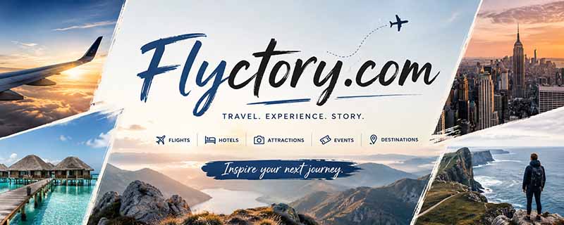
The next three proposals are kind of similar. They likely all use the ChatGPT engine. Travel. Experience. Story. is a nice slogan for the website. I also like the link to events. The design feels very modern, but also reflects professionalism. Nice.
LeonardoAI

Similar elements, as before – but as the link to aviation is more limited than well as the overall setup, I feel that ChatGPT did a better job than LeonardoAI. I feel this banner could rather be a nice one for a travel agency.
Lumina

What I really like about this is the sign on the right. With a few more prompts, you could likely add some nice features to it. Similar to the LeonardoAI proposal, I wonder whether a banner shouldn’t have a significantly longer horizontal width, compared to its height. Nonetheless, this one is a “could be fun to put some more prompts on it” one.
Cranyon.com

Cranyon is the best of the options I finally don’t like. The font is very boring and generic, there is no slogan or similar. At least the setting with the sun and the plane feels nice and suitable.
PicExact

I lik ethe picture as such. However, does this one really fully reflect my website? The letters feel extremely cheap. PicExact’s suggestion finally does no tell too much about the website.
Google Gemini

Google Gemini is maybe the biggest disappointment. I felt that Gemini could be one of the strongest options, but finally, it is a generic banner. At least, there is the right font and some green and white. Explore – Discover – Experience is absolutely generic as well. Gemini missed most of the demands I had in mind.
Canva

Especially as I have a professional Canva account, I was kind of disappointed. I felt Canva could be cool, especially as the tool is built to present contents in a cool way. But I guess, it is more about TikToks and Instagram stories nowadays.
Raphael AI
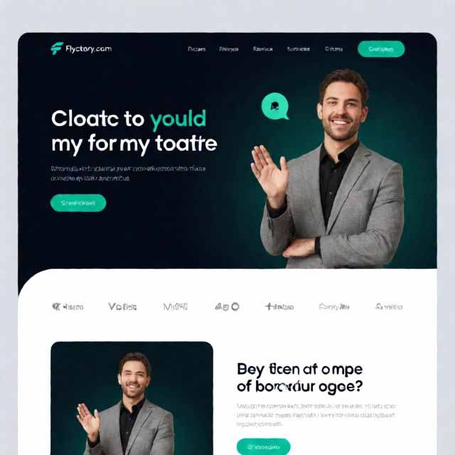
One positive point is that this suggestion holds the website’s name correctly. Apart from that, Raphael AI is a complete fail. It is not even a banner at all. What does that guy have in common with my blog? No more comments, that would be a really bad mark in elementary school already.
Doing it a bit more professionally…
With Copilot having my most favorable creation, I felt to give it some more prompts like using the corporate design. I feel that approach is not bad at all. However, it still comes with that artificial design.

A More Complex Prompt …
… with ChatGPT
Just for illustration, I used a more complex prompt to illustrate how much better the Large Language Models work when you give them more explicit information. As I usually use ChatGPT privately, I felt starting with that one. Below is the prompt and the result the AI tool created.
I would like to have a new banner for my website Flyctory.com. It’s slogan is “Travel, Music, Sports & more”. Key contents are album reviews, country music, concert photography, sports reports and sports photography, majorly floorball, and travel. On the travel side, I deal a lot with aviation, hotel reviews and reviews of sights all around the globe. The banner should stick to the green and white design of the website and can be rather abstract or comic style.

There are a lot of cool characteristics in this one. I love the dynamics, the references to the key topics and, overall, the dynamic design. I also feel that the choice of the font is a nice one.
… using CoPilot
I used the same prompt on Copilot. You see that there is a clear similarity to the short prompt result above. One thing I wondered about is that Copilot knows floorball, takes the right stick and ball (nice color highlighting of the ball, by the way, but the player rather looks like a lacrosse one. We don’t wear helmets in floorball. Weird thing. In this small side note competition, I feel that ChatGPT does the much more professional design proposal.

All “classic” blog posts
No reviews – just debating and certain topics. These are my “traditional” blog posts in the categories Just blogging, Just blogging on music and Sports Blogging:

We Will Always Love You – R.I.P. Dolly Parton

Who Treats Me Best? My Favorite Loyalty Schemes

Why I Did not like the ESC 2026 public vote – and how I would change it
The Eurovision Song Contest 2026 – I am Rating All Songs
Using the Power Socket? Not Allowed! About a Weird Hotel Experience in Switzerland
My Loyalty Portfolio 2026

20 Years Later – The (Mountain) Sites of the 2006 Torino Winter Olympics

What’s Up, Country Music in Europe?

Country To Country 2026 in Berlin – My Thoughts

My Five Hot Takes and Thoughts about the Milan-Cortina Olympic Winter Games 2026

The Flyctory.com-Style Medal Count of the 2026 Milan/Cortina Olympics
Praising a Flight Crew – My Recent Eurowings EW 1778/1779 Experience

The Whoopgate – My Thoughts about Wearables in Sports

70 Years of ESC – The Eurovision Song Contest is Coming To You
Faroe Islands Fans at The EHF Euro 2026 in Oslo

The C2C Berlin 2026 Line-Up is finalized – Here are my Favorites

My Wishes for the Floorball Year 2026 (or later…)

Flyctory.com Best Ones 2025

Flyctory.com – My Favorite Albums / EPs 2025

Flyctory.com – My Favorite Songs 2025
2025 – My Year in Travel

My Twelve Favorite Songs about Feeling Cologne

Flyctory.com goes LinkedIn with a monthly update
The Sheep Islands Did It Again – My Thoughts about the Success of Sports on the Faroe Islands

200 Episodes of “Songs of the Week” – Here are my favorite ones

I’m bringing back the New Country Songs Playlist

Direct Trains from Germany to London – Will It Ever Happen?

After the Intermediate Report has been released – My Thoughts About the Air India 171 Incident

Flyctory.com Introduces the Featured Athletes – here is my first selection

Flyctory.com Turned Off the Ads – Time for some Transformation

Marc-Andre Fleury made me do it – the (weird) Story of a Weekend in May 25
The Most Airports by Country I Have Flown To

Festivals and Open Airs – I Am Looking Forward to Summer 2025
Food I Had Onboard XXII (February 2025 – March 2025)

CMA Fest 2025 Lineup Announced – My Guide to the Festival

My Loyalty Portfolio 2025

C2C Country To Country Berlin 2025 – Splitter and Reprise
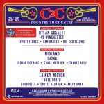
My Country To Country Berlin 2025 Preview
Let’s Praise Modern German Country Music – My Artist Overview

Food I Had Onboard XXI (January 2024 – early February 2024)

The Flyctory.com Country Music Playlists – My Favorite Artists

Food I Had Onboard XX (November 2024 – early January 2025)

Flyctory.com Best Ones 2024

Flyctory.com – My Favorite Albums / EPs 2024

Flyctory.com – My Favorite Songs 2024

2024 – My Year in Travel

Looking Forward To 2025 – My Highlights of The Next Year
4,000 Postings on Flyctory.com – Time to have a look back

Bye-Bye Lufthansa – my last Senator Anniversary

Food I Had Onboard XIX (October 2024)

Rock of Ages – 2025 International Dates of the Musical

Food I Had Onboard XVIII (end July to mid September 2024)

“Goldenes Oval” Opening Meeting – Opening Ceremony (Dresden, 30th August 2024)
Paris 2024 Olympics – My Tops and Flops

The Flyctory.com-Style Medal Count of the 2024 Paris Olympics
Food I Had Onboard XVII (mid-May to mid-July 2024)

International Tennis Hall of Fame – Class of 2024 Induction

International Tennis Hall of Fame – 2024 Inductees Press Conference

Infosys Hall of Fame Open 2024 – A Week of Tennis, Indian Celebrations, and a Farewell

NHL Schedule 2024-25 – My Suggested Trips

Rock of Ages – Which song is better? Original or Musical Version?

Food I Had Onboard XVI (mid-April to mid-May 2024)

WFC 2024 in Lahti – Splitter, Stats, & 3×3 Thoughts

The NY Sightseeing Pass or the New York Pass by Go City – Which One is better?

The Debut – Just One Week Until the 3×3 World Floorball Championships in Lahti
My Preview to the Under 19 Girls World Floorball Championships in Lahti

Flyctory.com Is Introducing “Featured Clubs” – Sports Teams & Federations in Focus

Food I Had Onboard XV (March 2024 – early April 2024)

My 15 Favorite Hotels I Have Stayed in… So Far

My Loyalty Program Portfolio 2024
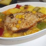
Food I Had Onboard XIV (January 2024 – early March 2024)

The Renewed Flyctory.com Country Music Playlists

Andreas Dorau – My Most Favorite Songs and Lines

Food I Had Onboard XIII (End November 2023 – early January 2024)

Flyctory.com Best Ones 2023

Flyctory.com – My Favorite Albums / EPs 2023

Flyctory.com – My Favorite Songs 2023

2023 – My Year in Travel

Santa’s Soundtrack 2023? Some Christmas Releases This Season
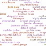
The Day Music Neutrality Died (a bit) – Thank You Everynoise.com

Food I Had Onboard XII (Late October 2023 – Mid-November 2023)

Naughty or Nice? – The Flyctory.com Country Christmas Playlist 2023

Country To Country is back in Central Europe – Here are the Main Acts

Food I Had Onboard XI (Mid September 2023 – October 2023)

The Privilege of the Loo – On Bathroom Distribution in Airplanes

Rock of Ages – 2024 International Dates of the Musical
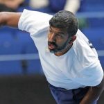
Thank You, Rohan Bopanna!

Food I Had Onboard X (July 2023 til early September 2023)

Praise The Underdogs – I Look Back to the European Soccer Competition Qualifications

Heart to Heart – Semmel Concerts Introduces the Songwriters Round to Germany

Home is where the heart is – My Twelve Favorite Cities of the World

NHL Schedule 2023-24 released – Here are my suggested Trips

Seepark Biker Days Pfullendorf 2023 – Atmosphere & Impressions

Seepark Biker Days Pfullendorf 2023 – A Preview

Food I Had Onboard IX (Mid-May 2023 til June 2023)

Rock of Ages UK Tour – A Personal Farewell and Thanks

My Traveler’s Thoughts About… Renting a Car and Driving in Iceland

Food I Had Onboard VIII (April 2023 til Mid-May 2023)

My Favorite Eurovision Song Contest Songs

Traveling on Iceland’s Ring Road (Reprise)

Travel all Germany for 49 EUR a Month? The New Deutschland Ticket

Rock of Ages Opening Night – Red Carpet Impressions

Thumb Up or Down? A Personal View on my Loyalty Program Portfolio

Food I Had Onboard VII (mid-February 2023 til March 2023)

Five Years of Flyctory.com – My 20 Most Popular Travel Posts (so far…)

Jim “Kimo” West is playing the very first German Weird Al Show tonight – he is back with “Nacht der Gitarren” in Fall

Food I Had Onboard VI (December 2022 til mid-February 2023)

Davis Cup Qualifiers – A Bad Day For (Men’s) Doubles Tennis

Flyctory.com Best Ones 2022

Flyctory.com – My Favorite Albums / EPs 2022

Flyctory.com – My Favorite Songs 2022

How I would love European Flight Compensation Regulation to Change

Covid-19, Strikes and more – My Flight Rebooking Experience

Some 2022 new Christmas Song Releases – Good Ones and Weird Ones
Food I Had Onboard V (September 2022 til November 2022)

Loyalty Programs – Are We Too Committed To Stay Rational?

Weird Al Yankovic is touring Europe 2023 – Tour Dates and Travel Hints

Visiting the Lillehammer 1994 Olympic Sites in 2022

Steel Guitar Santa is Back – The Flyctory.com Country Christmas Playlist 2022

Rock of Ages – International Dates of the Musical in 2023
Food I Had Onboard IV (May 2022 til August 2022)

NHL Schedule 2022-23 released – Some suggested Icehopping Itineraries
The Bergisch Coffee Table (Bergische Kaffeetafel) – A Sweet and Savory Tradition

European Airports Go Mad – a Morning at Dusseldorf Airport

Food I Had Onboard III (Mar 2022 til April 2022)
Currently my favorite animal: Leon The Lobster
Food I Had Onboard II (Nov 21 til Mar 2022)

No Business as Usual – but I felt it is right to continue to share the World with you…

Beijing 2022 – No Flyctory.com Medal Count, Just Thoughts…

Riding the Swan Adventure Pedal Boat in Dubai – A Special Ride and Posting

Rock of Ages – Central European Shows of my Favorite Musical in 2022

Flyctory.com Best Ones 2021

Flyctory.com – My Favorite Albums / EPs 2021

Flyctory.com – My Favorite Songs 2021

Some Non-Country Christmas Songs 2021

My Top 15 Airports Flown – With Some Brief Thoughts

Ho Ho Ho – The Flyctory.com Country Christmas Playlist 2021

Food I Had Onboard (Oct 2021 til Nov 2021)
The Hits of the Trips – My Summer 2021 in Music

My Hotel Checklist – Some Services Too Many Overnights are still failing at

Tokyo 2020 – My Thoughts By Sports (… and some more)

The Flyctory.com-Style Medal Count of the 2021 Tokyo Olympics
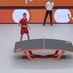
Some weird sports I discovered during Covid-19

The Twelve Best Flights Of My Life (… so far)

Music Publications – Does Nowadays The Length Still Matter?

Smooth McGroove – A Very Special Kind of Gaming Music

Jan-Marten Block is the German Idol – Some Thoughts After a Strange Season

Bricky Trouble over Germany

Cologne – My Ten Favorite Songs About My Home Town

(Over) 400 Media Reviews on Flyctory.com – your most popular ones
The Dutch Museumkaart – One Year of Culture and History (almost) for free in the Netherlands

Understanding Train Station – A Podcast on Living Abroad and Cultural Differences
Dubai – A December 2020 Pandemic Disappointment

Flyctory.com Best Ones 2020

Flyctory.com – My Favorite Albums / EPs 2020

Flyctory.com – My Favorite Songs 2020

“Zärtliche Chaoten II” – exploring Gran Canaria 32 years later

My Ten Favorite Weird Al Yankovic Songs

My First PCR Test (Centogene Dusseldorf Airport)

Seven Things I look forward to do in the United States again

Some Christmas Present Ideas for Flyctory.com Music Lovers

Hawk-Eye Live – the End of the Tennis Line Judges?
The Country Music Week turns Digital

One Year of Flyctory.com Country Music Playlists

The Big Three of Tennis Men Singles – Unique Dominance?

German Girl in America – YouTube Videos about US-German Differences

Nashville, Let the Girls Play – Some Thoughts on Women Country Music

Olivia Lane – “Living Instead” Podcast about Artists’ Life and More

“Lady Antebellum” becomes “Lady A” – My Thoughts

Lake Constance after the touristic Lockdown – My Experience

Women Soccer Bundesliga is back – But some Girls score in a different Way

Mrs. Greenbird: Strong Crowdfunding Start for New Album

Back To Soccer-Country: Germany

Kenny Foster – His Stories behind “Deep Cuts”

Flyctory.com vs. Covid-19 – An unequal battle

Two new Flyctory.com-managed Playlists on Amazon Music and Spotify

Made in Bolka – About the Rise of a Floorball Club

My Favorite C2C: Country To Country 2020 Songs

Why I feel it makes sense to continue Flyctory.com during the Corona crisis

C2C Country To Country Berlin – Day 3 (08.03.2020) – Splitter
C2C Country To Country Berlin – Day 2 (07.03.2020) – Splitter

C2C Country To Country Berlin – Day 1 (06.03.2020) – Splitter

Flyctory.com Best Ones 2019

Christmas Songs – Why not Hawaiian Style?

My Favorite Music Albums 2019

Flyctory.com – My Favorite Songs 2019

No Women WFC 2019 Coverage on Flyctory.com?

Flyctory.com – My Postings on a Map

Luke Combs – This One’s For You – The Record-Breaking Album

Frog Leap – An Amazing Project Back On Tour 2020
The Flyctory.com Country Music Playlists – The First Ten Weeks

Country 2 Country 2020 Lineup – My View

Sound of Nashville Press Event & Logan Mize Concert (11th Sep 2019, Cologne)
Flyctory.com on Spotify and Amazon Music Unlimited

A Preview to Country Music Concerts (European Tours)

Very Important Postings – January to June 2019

CMA Fest 2019 – My Meet & Greets

Visiting CMA Fest 2019
My Favorite CMA Fest Songs 2019
Christina Taylor & Carolyn Miller – Two Upcoming Country Artists

CMA Fest 2019 – Fan Events with Cassadee Pope and Jana Kramer

Country Music Concert Summer 2019 in Germany – a small Boom?

Shallow-ism – One Song in countless Versions

My Favorite Country 2 Country Songs 2019
European World Floorball Championship Qualification – A Preview

Entertaining or not? An Inflight Magazine Comparison

Floorball Champions Cup 2019 – A Preview to Gävle
Very Important Postings – July to December 2018

My Favorite Songs 2018

How to buy a Hotel Group Status

Davis Cup World Group Playoff 2018 – More complex than ever!

Very Important Postings – Flyctory.com’s 1st Half 2018

Flyctory.com’s Introduction on Mileage Pooling

Atlanta 1996 – 22 Years later

Ode to my Superhero – Leander Paes

My favourite Country 2 Country 2018 songs


My Medal Count Winner 2018: Canada

Why WordPress?
Flyctory.com Floorball Postings
Here are all Floorball-related postings on Flyctory.com:

Swedish Floorball Finals (Men) – Storvreta IBK – IBF Falun 3-2 (1-0, 1-2, 1-0)

Swedish Floorball Finals (Women) – Thorengruppen IBK – FBC Kalmarsund 4-2 (2-2, 0-0, 2-0)
SSF Dragons Bonn – MFBC Leipzig 3-2 (0-1, 2-0, 1-1)
Swiss Cup Finals – Men Small Field – I.M. Davos-Klosters – UHC Oekingen 8-10 (4-3, 3-2, 1-5)

Swiss Cup Finals – Men – HC Rychenberg Winterthur – Floorball Thurgau 2-4 (0-1, 1-3, 1-0)
Swiss Cup Finals – Women – Skorpion Emmental Zollbrück – Zug United 5-6 (1-3, 2-3 2-0)
Swiss Cup Finals – Women Small Field – UHC BEO III – UHC Oekingen 10-11 (4-4, 2-5, 4-2)
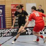
WFCQU19 2026: Germany – Hungary 6-1 (1-0, 2-1, 3-0)
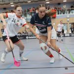
WFCQU19 2026: France – Austria 4-12 (2-5, 0-5. 2-2)
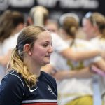
WFCQU19 2026: France – Germany 0-16 (0-5, 0-4, 0-7)

WFCQU19 2026: Ukraine – Hungary 2-12 (0-3, 2-3, 0-6)

DJK Holzbüttgen – SSF Dragons Bonn 4-7 (1-3, 0-3, 3-1)
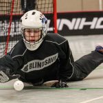
Northrhine-Westphalia Under 13 Small Field Matchday (10th January 2026, Heiligenhaus)
SSF Dragons Bonn – SC Potsdam 11-3 (3-1, 4-1, 4-1)
Pixbo IBK – Warberg IC 4-3 (2-0, 1-1, 1-2)
Hovslätts IK – Visby IBK 4-8 (3-1, 0-3, 1-4)

Pixbo IBK – Storvreta IBK 9-4 (4-2, 1-2, 4-0)
My Wishes for the Floorball Year 2026 (or later…)
Flyctory.com Best Ones 2025

Finnish Floorball Museum (Salibandymuseo)
Nystars – SB Vantaa 9-2 (3-0, 3-0, 3-2)

AFC Campus – SB-Pro II 1-3 (0-0, 1-1, 0-2)
HIFK – SBSV 3-6 (2-0, 0-3, 1-3)
SB-Pro – EräViikingit 1-0 (0-0, 1-0, 0-0)
SC Classic – JYMY 8-3 (4-1, 3-2, 1-0)

Zug United – Kloten-Dietlikon Jets 2-7 (1-2, 0-3, 1-2)
Zug United U21 – Kloten-Dietlikon Jets U21 4-7 (2-3, 1-2, 1-2)
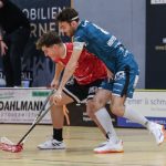
DJK Holzbüttgen – SC Potsdam 13-6 (4-1, 1-2, 8-3)
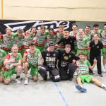
SSF Dragons Bonn – SC DHfK Leipzig 4-6 (0-1, 1-2, 3-3)
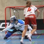
FZ17 All-Star Game (12th July 2025, Hamburg)

FZ17 Small Field Tournament (12th July 2025, Hamburg)
Flyctory.com Introduces the Featured Athletes – here is my first selection
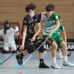
German Under 15 Floorball Nationals – Placement Matches (6th July 2025)

German Under 15 Floorball Nationals – Final: PSV Black Wolves Dessau – FBC Munich (6th July 2025) 5-8 (1-3, 2-1, 2-4)

German Under 15 Floorball Nationals – Semifinals (6th July 2025)
German Under 15 Floorball Nationals – Group B Matches (5th July 2025)

German Under 15 Floorball Nationals – Group A Matches (5th July 2025)

Swedish Floorball Finals (Men) – Storvreta IBK – IBF Falun 3-2 (0-0, 0-1, 3-1)

Swedish Floorball Finals (Women) – Pixbo IBK – Thorengruppen IBK 5-7 (0-2, 2-4, 3-1)

SSF Dragons Bonn – MFBC Leipzig 2-5 (1-1, 0-0, 1-4)
Swiss Cup Finals 2025 (Women Small Field): Skorpion Emmental Zollbrück III – Unihockey Berner Oberland III 20-6 (9-2, 5-1, 6-3)
Swiss Cup Finals 2025 (Men): Zug United – HC Rychenberg Winterthur 2-7 (0-1, 0-3, 2-3)

Swiss Cup Finals 2025 (Women): Piranha Chur – Kloten-Dietlikon Jets 8-4 (2-2, 2-1, 4-1)

Swiss Cup Finals 2025 (Men Small Field): Tigers Langnau III – UHC Oekingen 9-10 SD (3-4, 4-2,2-3, x-1)
SSF Dragons Bonn (Women) – ETV Lady PiranHHas Hamburg 4-2 (2-0, 2-1, 0-1)

SSF Dragons Bonn II – ETV PiranHHas Hamburg II 6-7 SD (2-0, 4-4, 0-2, x-1)
Women WFCQ – P7 Match – Hungary – France 4-2 (0-1, 2-0, 2-1)
Women WFCQ – P5 Match – Denmark – Italy 6-3 (1-0, 4-1, 1-2)
Women WFCQ – Switzerland – Hungary 22-0 (4-0, 10-0, 8-0)

Women WFCQ – Denmark – Netherlands 2-5 (1-1, 1-0, 0-4)
Women WFCQ – Poland – Slovakia 2-4 (1-2, 1-1, 0-1)
Women WFCQ – Denmark – Switzerland 0-15 (0-3, 0-8, 0-4)
Women WFCQ – Italy – France 6-1 (2-0, 1-0, 3-1)
Women WFCQ – Hungary – Netherlands 1-4 (0-1, 0-2, 1-1)
Women WFCQ – Slovakia – France 14-1 (4-0, 4-1, 6-0)
SaiPa – SB-Pro 2-1 SD (0-0, 0-0, 1-1, 1-x)

EräViikingit – Classic 6-4 (2-0, 1-2, 3-2)
Flyctory.com Best Ones 2024
Pixbo IBK – IBF Falun 11-0 (0-0, 6-0, 5-0)

Pixbo IBK – IBK Dalen 9-6 (2-0, 3-2, 4-4)
ETV PiranHHas Hamburg – Blau-Weiß Schenefeld 3-5 (0-2, 2-1, 1-2)
ETV PiranHHas Hamburg II – TV Eiche Horn Bremen 7-4 (2-2, 2-0, 3-2)

SSF Dragons Bonn – DJK Holzbüttgen 5-4 SD (4-0, 0-3, 0-1, 1-x)

SSF Dragons Bonn – TSG Erlensee 2-1 (1-1, 1-0, 0-0)

Great Britain (M) – Hungary (M) 4-6 (1-2, 2-2, 1-2) – SO 2-2

Great Britain (W) – Hungary (W) 8-2 (2-0, 2-1, 4-1) – SO 0-3

Austria (W) – Slovakia (WU19) 3-5 (0-1, 1-3, 2-1) – SO 2-0

SSF Dragons Bonn II – Lilienthaler Wölfe 4-7 (1-1, 3-4, 0-2)

Unihockey Igels Dresden – UHC Sparkasse Weißenfels 3-10 (0-6, 1-2, 2-2)
WFC 2024 in Lahti – Splitter, Stats, & 3×3 Thoughts
WFC 3×3 Floorball 2024 – Day 2 Men’s Finals (12th May 2024)
WFC 3×3 Floorball 2024 – Day 2 Women’s Finals (12th May 2024)
WFC 3×3 Floorball 2024 – Day 1 Men’s Competition (11th May 2024)
WFC 3×3 Floorball 2024 – Day 1 Women’s Competition (11th May 2024)

WFC U19 Girls 2024 Final: Sweden – Finland 4-2 (1-0, 1-0, 2-2)
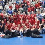
WFC U19 Girls 2024 Bronze Medal Match: Switzerland – Czechia 1-5 (0-2, 0-2, 1-1)
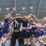
WFC U19 Girls 2024 Semifinal: Czechia – Finland 2-3 SD (1-1, 0-0, 1-1, x-1)

WFC U19 Girls 2024 Semifinal: Sweden – Switzerland 4-3 (1-1, 2-0, 1-2)
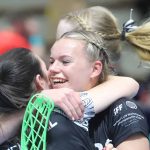
WFC U19 Girls 2024 Place 13: Hungary – New Zealand 6-8 (3-1, 0-3, 3-4)
WFC U19 Girls 2024: Italy – Hungary 3-3 (1-1, 2-1, 0-1)
WFC U19 Girls 2024: Finland – Norway 3-0 (2-0, 0-0, 1-0)
WFC U19 Girls 2024: Switzerland – Slovakia 5-2 (2-0, 2-1, 1-1)
WFC U19 Girls 2024: New Zealand – Australia 10-3 (1-0, 6-2, 3-1)

WFC U19 Girls 2024: Canada – Italy 3-11 (1-3, 1-3, 1-5)

WFC U19 Girls 2024: Hungary – Denmark 2-11 (2-3, 0-3, 0-5)
WFC U19 Girls 2024: Sweden – Finland 9-3 (4-1, 3-0, 2-2)
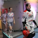
WFC U19 Girls 2024: Czechia – Switzerland 4-1 (0-1, 1-0, 3-0)
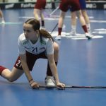
WFC U19 Girls 2024: Slovakia – Latvia 8-3 (2-2, 1-1, 5-0)
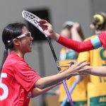
WFC U19 Girls 2024: Singapore – Australia 7-4 (2-1, 2-0, 3-3)
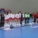
WFC U19 Girls 2024: Hungary – Canada 8-2 (2-1, 3-1, 3-0)

WFC U19 Girls 2024: Slovakia – Czechia 1-16 (1-4, 0-5, 0-7)
WFC U19 Girls 2024: Latvia – Switzerland 1-8 (0-4, 1-3, 0-1)
WFC U19 Girls 2024: Norway – Sweden 1-16 (0-7, 1-5, 0-4)

WFC U19 Girls 2024: Australia – Germany 1-12 (1-5, 0-4, 0-3)
The Debut – Just One Week Until the 3×3 World Floorball Championships in Lahti
My Preview to the Under 19 Girls World Floorball Championships in Lahti
Swedish Floorball Finals (Men) – Storvreta IBK – Pixbo IBK 8-5 (3-1, 1-1, 4-3)

Swedish Floorball Finals (Women) – Thorengruppen IBK – Pixbo IBK 6-3 (2-0, 0-1, 4-2)
Flyctory.com Is Introducing “Featured Clubs” – Sports Teams & Federations in Focus

Swiss Floorball Superfinal (Men) – SV Wiler-Ersigen – Zug United 5-6 (0-2, 2-3, 3-1)

Swiss Floorball Superfinal (Women) – Kloten-Dietlikon Jets – Zug United 6-5 SO (1-3, 3-1, 1-1, 0-0, 1:x)

Dümptener Füchse – UHC Sparkasse Weissenfels 1-6 (0-3, 0-1, 1-2)
TSG Erlensee – TSV Calw Lions 8-7 SD (1-3, 4-2, 2-2, 1-x)
TSG Erlensee – Dümptener Füchse 0-11 (0-5, 0-5, 0-1)

ASV Cologne – Floor Fighters Chemnitz 3-13 (0-3, 1-5. 2-5)

Lejon Zäziwil – Red Lions Frauenfeld 2-1 SD (1-0, 0-0, 0-1, 1-x)
Zulgtal Eagles – Visper Lions 0-4 (0-1, 0-1- 0-2)
Flyctory.com Best Ones 2023

Pixbo Wallenstam IBK – Malmö FBC 8-2 (2-0, 4-2, 2-0)

CC 2024: SV Wiler-Ersigen – FbS Bohemians 5-3 (1-1, 2-3, 3-0) – Showdown 1-x

CC 2024: Floorball Köniz Bern – Tatran Stresovice 2-5 (1-1, 1-1, 0-3)

Dümptener Füchse – ETV Lady Piranhhas Hamburg 7-4 (3-0, 1-0, 3-4)
SSF Dragons Bonn – Red Devils Wernigerode 5-4 (2-2, 0-2, 3-0)

Red Devils Wernigerode – Berlin Rockets 8-11 (1-2, 2-6, 5-3)
Red Devils Wernigerode – UHC Weissenfels 6-5 (2-3, 3-1, 1-1)
Flyctory.com Best Ones 2022
German Floorball Under 15 Girls – Final: Red Devils Wernigerode – Dümptener Füchse 5-4 SD (1-1, 3-3, 1-x)
German Floorball Under 15 Girls – P3 Match: SG Weissenfels/Jena – FBC Havel 6-9 (1-5)

German Floorball Under 15 Girls – P5 Match: FC Stern Munich – Sportvg Feuerbach 11-1 (2-1)
Floorball Final4 Semifinals at Max-Schmeling-Halle Berlin

SSF Dragons Bonn – ETV Piranhhas Hamburg 4:6 (1:3, 0:3, 3:0)
Flyctory.com Best Ones 2021

German Cup: DJK Holzbüttgen – PSV 90 Black Wolves Dessau 14:1 (4:0, 4:0, 6:1)

F-Liiga Women: SB-Pro Nurmijärvi – TPS Turku 2-5 (1-3, 0-2, 1-0)

F-Liiga Women: EräViikingit – SSRA 7-2 (3-1, 1-0, 3-1)

F-Liiga Women: FBC Loisto – SB-Pro Nurmijärvi 4-6 (3-1, 0-2, 1-3)

F-Liiga Women: EräViikingit – Classic 3-1 (1-0, 1-0, 1-1)
Flyctory.com Best Ones 2020
Made in Bolka – About the Rise of a Floorball Club

SB-Pro Nurmijärvi – Classic Tampere 4:2 (0:1, 4:1, 0:0)

SB-Pro Nurmijärvi – Koovee Tampere 7:2 (2:1, 3:1, 2:0)
Flyctory.com Best Ones 2019
No Women WFC 2019 Coverage on Flyctory.com?

SSF Dragons Bonn – MFBC Leipzig/Grimma 0:3 (0:1, 0:0, 0:2)

DJK Holzbüttgen – SSF Dragons Bonn 9:8 (2:4, 3:2, 4:2)

Floorball RENEW Cup 2019 (Holzbüttgen, Germany)

UHC Laupen U21 – Red Ants Rychenberg U21 7:1 (2:1, 4:0, 1:0)

SSF Dragons Bonn – TV Schriesheim 5:8 (1:1, 3:1, 1:6)
WFCQ 2019: Germany – Russia 8:4 (4:1, 3:3, 1:0)

WFCQ 2019: Finland – Austria 37:0 (12:0, 10:0, 15:0)
WFCQ 2019: Hungary – Netherlands 4:1 (1:1, 1:0, 2:0)

WFCQ 2019: Slovakia vs. Latvia 5:3 (2:1, 3:2, 0:0)

WFCQ 2019: Netherlands – Latvia 2:11 (1:5, 0:2, 1:4)

WFCQ 2019: Slovakia – Hungary 12:1 (3:0, 5:1, 4:0)

WFCQ 2019: Russia – Finland 1:18 (1:2, 0:13, 0:3)
WFCQ 2019: Austria – Spain 5:5 (2:0, 3:2, 0:3)

WFCQ 2019: Austria – Russia 4:13 (1:3, 1:5, 2:5)
WFCQ 2019: Netherlands – Slovakia 2:8 (0:1, 1:5, 1:2)
WFCQ 2019: Spain – Germany 3:6 (0:1, 1:3, 2:2)
European World Floorball Championship Qualification – A Preview

Red Lions Frauenfeld – Kloten-Dietlikon Jets 3:12 (0:4, 1:5, 2:3)

Floorball Riders DBR – UH Appenzell 5:4 (3:2, 2:1, 0:1)

Täby FC – Pixbo Wallenstam IBK 7-0 (3-0, 2-0, 2-0)

FBI Tullinge – Hagunda IF 4-5 SD (0-1, 1-2, 3-1, 0-1)
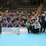
CC 2019: Men’s Final: Storvreta IBK – SC Classic 3-10 (1-3, 1-3, 1-4)

CC 2019: Women’s Final: Vitkovice – IKSU 3-8 (1-2, 2-4, 0-2)

CC 2019: Men’s Place 3: Florbal Mlada Bolesav – Floorball Köniz 2-9 (1-4, 1-3, 0-2)

CC 2019: Storvreta IBK – Florbal Mlada Bolesav 10-5 (2-0, 3-3, 5-2)
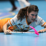
CC 2019: Women’s Place 3: SB-Pro Nurmijärvi – Piranha Chur 5-3 (2-1, 0-1, 3-1)

CC 2019: IKSU – Piranha Chur 11-5 (6-1, 1-1, 4-3)
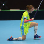
CC 2019: SB-Pro Nurmijärvi – 1. SC TEMPISH Vitkovice 4-5 SD (2-0, 1-4, 1-0, 0-1)

CC 2019: SC Classic – Floorball Köniz 7-1 (3-0, 1-1, 3-0)
Floorball Champions Cup 2019 – A Preview to Gävle
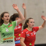
Red Ants Rychenberg – UHC Waldkirch-St.Gallen U21A 4:3 (2:1, 1:1, 1:1)
Red Ants Rychenberg – UHC Laupen 2:4 (2:1, 0:3, 0:0)

SB-Pro Nurmijärvi – Koovee Tampere 11-3 (4-0, 3-2, 4-1)

Floorball Bundesliga: DJK Holzbüttgen – ETV Piranhhas Hamburg 2:7 (1:3, 0:4, 1:0)
Finnish Superfinal (Men): Classic – Happee 6:2 (0:2, 4:0, 2:0)

Finnish Superfinal (Women): Classic – SB-Pro 2:3 (0:0, 2:2, 0:1)