Red Dot Design Museum Essen
9 EURFlyctory.com Pros
- A lot of very stylish items
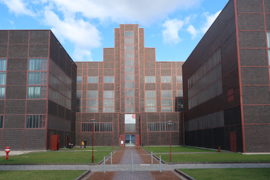
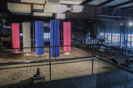
- Amazing architecture (which is likely already worth the visit)
Flyctory.com Cons
- All award winners in one place - which means several washing or coffee machines all next to each other
- Hardly any background information about the background of the design, too uncritical and arbitrary
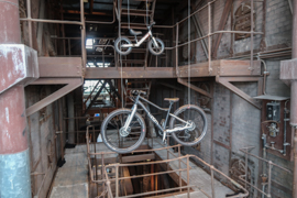
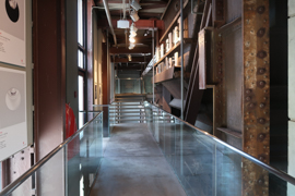
- Not suitable if you are afraid of height
- Rather a touch of a sales exhibition
The Red Dot Design Award is one of the most well-known (and prestigious) design awards in the world. However, the Award is driven by a company, who is doing excellent branding around the red and white ball. Contestants first have to pay a registration fee – and if you finally make it, you need to purchase a Winner Package, which may cost at least some 4,000 Euro (see participation conditions). Being a winner feels to be very favorable: the website lists 1,708 winners for 2020 only. At the home town of the Red Dot GmbH & Co. KG, in Essen in Germany, the company is driving the Red Dot Design Museum.
Red Dot Design Museum – Location & Admission
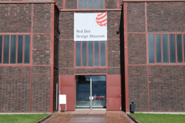
The Red Dot Design Museum is located close to the famous Shaft #12 of the Zeche Zollverein grounds. In my Pictured Story about the Zeche Zollverein, I introduced you to the traffic conditions already. There is a major (free) parking lot nearby. You may also use the tram to Zollverein, line 107. Other tram and rail stations are not recommended by me if you want to visit the museum.
The museum is opening Tuesdays to Sundays, 11:00 to 18:00 hrs. On Northrhine-Westphalia school holidays, the museum is also opening on Mondays. Adult admission is 9 Euro. The museum is accepting the RUHR.TOPCARD. On Fridays, there is Pay-What-You-Want and you define the admission price by yourself.
Red Dot Design Museum – The Visit
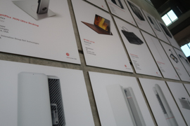
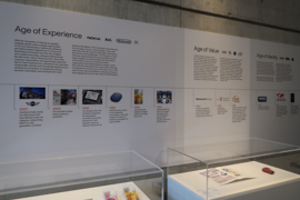
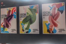
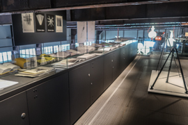
My review is based on a visit in March 2021, so that the 2020 Red Dot Design Award winners have been in display. There are a lot of items to see. In general, there is an information sheet about practically every exhibit. However, you just learn about the designer, the company (incl. country) and the name of the item. Extremely rarely, you learn something about the background, why the design is valuable and what makes the design better than peer or mass products.
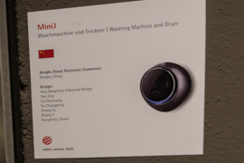
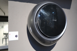
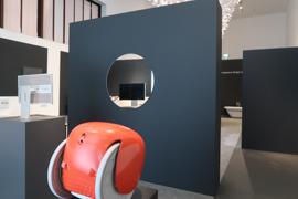
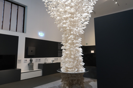
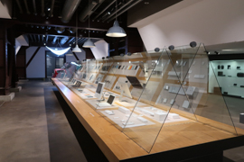
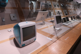
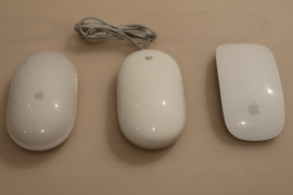
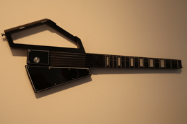
The first room on ground level featured a huge glass cabinet with Apple products. You could see a certain evolution of the design, but there is rare information about the background of that. In general, there are a lot of technical items in here, some boards giving German and English information about how design in general is adding value to that class of products. The ground floor majorly features computer appliances, musical instruments, but also some tools and similar items.
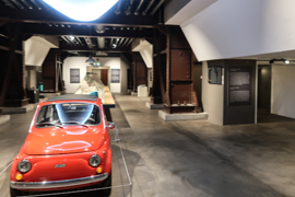
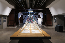
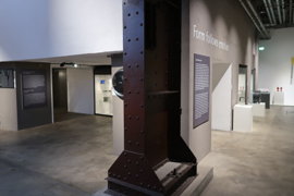
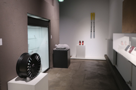
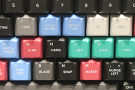
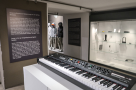
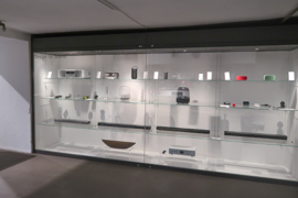
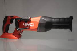
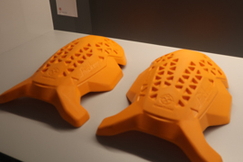
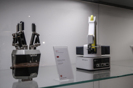
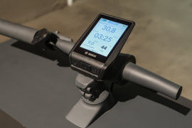
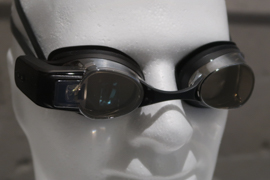
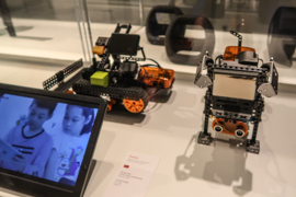
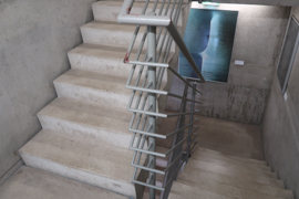
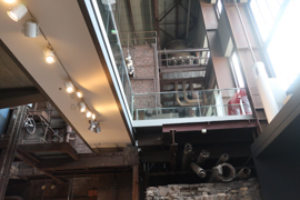
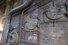
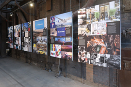
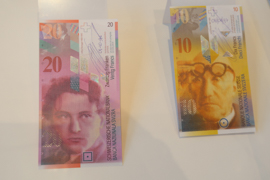
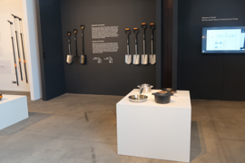
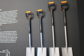
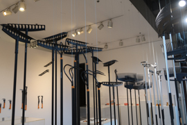
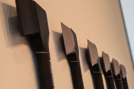
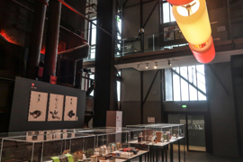
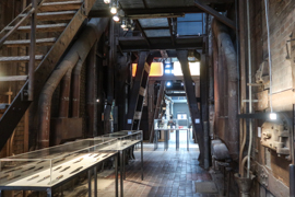
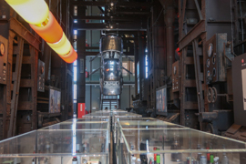
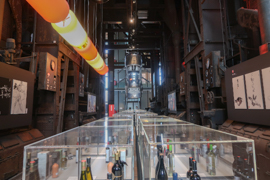
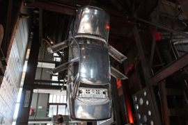
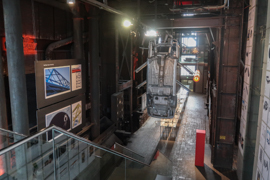
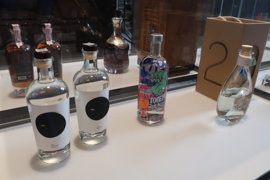
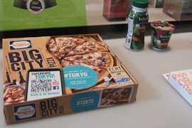
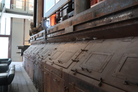
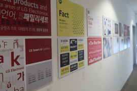
I would see the first floor as the heart of the museum. You can either use the elevator or staircases to reach the other levels. This first floor reflects the industrial style of the building best. It featured special sections about Corporate Design and honored the Design Agency of the Year. There was also a section solely presenting gardening tools by a Finnish company. Overall, the first floor features a wide range of items – I found out that even one of my favorite frozen pizza brands was part of the exhibition (due to their packaging design). The most famous – and eye-catching – part of your visit is also located on that floor. A raw body of a German car is hanging vertically down from the ceiling.


The Upper Levels – Don’t be exposed to vertigo!
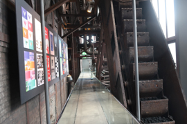
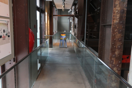
While I liked the first floor visit quite a much, I struggled with the upper floors. First of all, one reason is that areas on the upper floors are typically connected by footbridge-alike walkways, which can be quite high above the floor. Yeah, this museum is barrier free in a way that wheelchair users are just limitedly blocked by stairs if they use the elevator – but you should make people aware of these kind of issues as well.
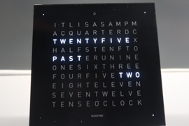
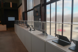
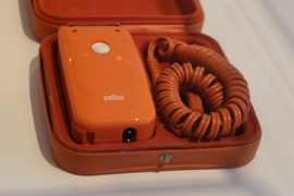
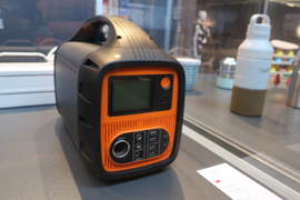
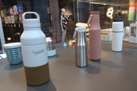
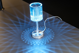
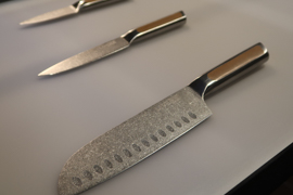
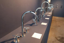
The second – and more important reason – was that the household appliance section of the museum even more illustrated the weakness of the “museum”: on the upper levels you may be in front of a half a dozen faucets, a bunch of bathtubs or a huge set of coffee machines. Yes, they may be nice items – but it also makes the exhibits somehow random and feel to finally decrease the value of the Red Dot Award itself (just to clearly state it again: all items you see on the pictures are 2020 Red Dot Award winners).
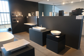
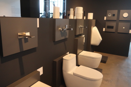
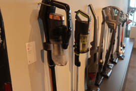
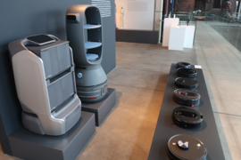
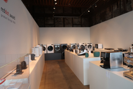
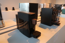
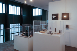
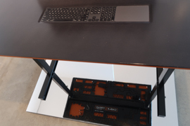
I also struggled with the concept of the museum and the award when I saw the table with the integrated computer and keyboard you see below. Yes, this one may look cool, but this is definitely not ergonomic. Shall design be harmful?
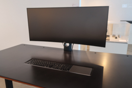
Red Dot Design Museum – Services
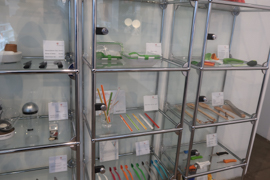
The staff at the museum was really friendly. At the entrance area, there is a shop with a bunch of design items.

Red Dot Design Museum – My View
Rating the Red Dot Design Museum is a real struggle to me. First of all, the building is impressive and the “museum” has a lot of exhibits. As I wrote above, I feel that the mass of items of the same kinds devalues both, the exhibits itself as well as the Red Dot Design Award as such. I haven’t materially learned anything about design, I had a stronger feeling that design might just be done to impress in constrast to to improve and I would likely rather less buy an item which has that Red Dot Design Award. Three things this place very likely did not want to cause in the thoughts and feelings of a visitor. In a that undifferentiated and uncritical way of presenting, the Red Dot Design Museum is rather a sales exhibition, which even charges admission fees. Thus, I feel rather disappointed.

